Portfolio Website: Customization Guide
Portfolio Website: Customization Guide
Once your portfolio is deployed, the next step is making it truly yours — not just personalized with your name and links, but visually and structurally tailored to how you want to present your work. This guide covers every major customization point: colors, fonts, sections, navigation, and adding entirely new pages.
Repository: github.com/bayzed123/sayadbayezid-portfolio-
Prerequisite: This guide assumes you've completed the Getting Started guide and optionally deployed your site.
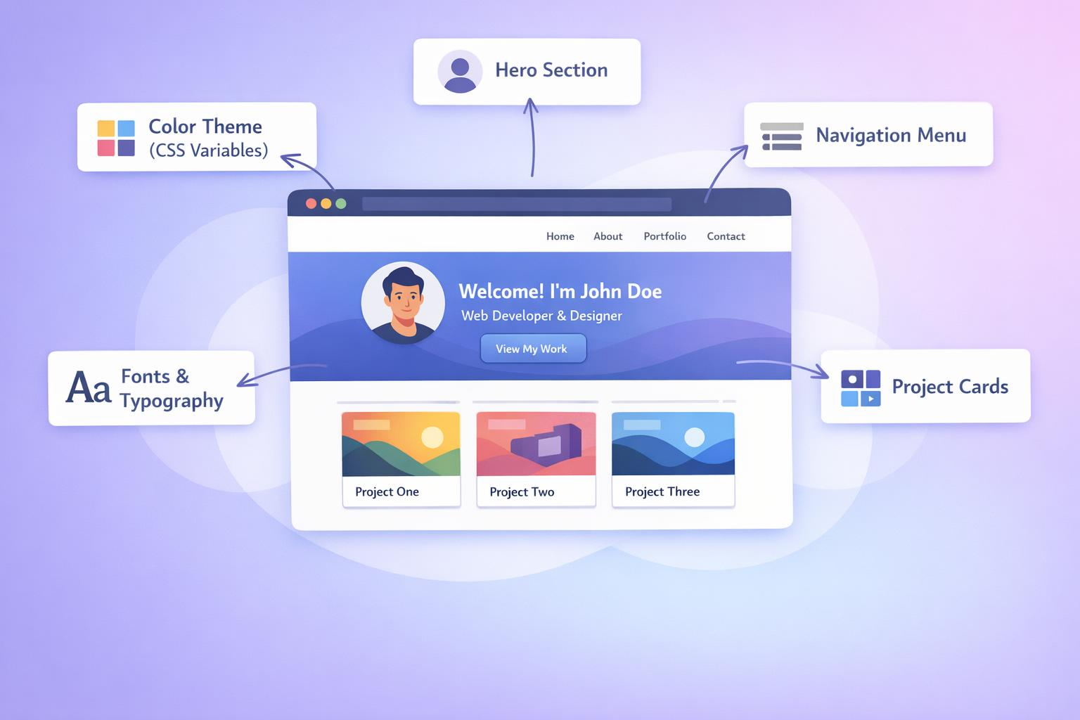
In this guide
- Before you start: recommended workflow
- Customizing colors and theme
- Customizing typography
- Editing the hero section
- Editing the about section
- Adding and editing project cards
- Customizing the navigation menu
- Editing the services/skills section
- Customizing the contact section
- Adding a completely new page
- Customizing the 404 page
- Working with multi-language support
- Responsive design considerations
- Troubleshooting
- Frequently asked questions
- Next steps
Before you start: recommended workflow
Customization involves editing plain HTML and CSS directly — there's no visual editor or admin panel. This is intentional: it keeps the project lightweight, fast, and fully under your control with no vendor lock-in.
Tip
Before making changes, create a new Git branch so you can experiment freely and revert if needed:git checkout -b customize-homepageOnce you're happy with your changes, merge back into
main:git checkout main git merge customize-homepage git push
Keep your local preview server running while you work (see the Getting Started guide) so you can see changes reflected immediately after saving each file.
npx serve .
Refresh your browser after each save to see the update.
Customizing colors and theme
All color values are centralized as CSS custom properties (variables) at the top of the main stylesheet — this is the single most impactful place to start customizing.
Step 1 — Locate the theme variables
Open assets/css/style.css and find the :root block near the top of the file:
:root {
  --primary-color: #2563eb;
  --secondary-color: #1e40af;
  --accent-color: #f59e0b;
  --background-color: #ffffff;
  --text-color: #1f2937;
  --text-muted: #6b7280;
  --border-color: #e5e7eb;
  --card-background: #f9fafb;
}
Step 2 — Change the values
Every other style rule in the file references these variables, so changing them updates the entire site consistently:
:root {
  --primary-color: #059669;    /* Changed from blue to green */
  --secondary-color: #047857;
  --accent-color: #f97316;
  --background-color: #ffffff;
  --text-color: #111827;
  --text-muted: #6b7280;
  --border-color: #e5e7eb;
  --card-background: #f0fdf4;
}
Note
You never need to search-and-replace colors throughout the file. Because every button, link, and highlight referencesvar(--primary-color)instead of a hardcoded hex value, updating the variable once cascades everywhere automatically.
Step 3 — Enable dark mode (optional)
If you want to support a dark theme, add a second variable set scoped to a .dark-mode class:
.dark-mode {
  --background-color: #0f172a;
  --text-color: #f1f5f9;
  --text-muted: #94a3b8;
  --card-background: #1e293b;
  --border-color: #334155;
}
Then add a simple toggle script in assets/js/theme-toggle.js:
const toggleBtn = document.querySelector('#theme-toggle');
const body = document.body;

// Restore saved preference on load
if (localStorage.getItem('theme') === 'dark') {
  body.classList.add('dark-mode');
}

toggleBtn.addEventListener('click', () => {
  body.classList.toggle('dark-mode');
  localStorage.setItem('theme', body.classList.contains('dark-mode') ? 'dark' : 'light');
});
And a toggle button in index.html:
<button id="theme-toggle" aria-label="Toggle dark mode">🌙</button>
Color palette reference table
| Variable | Purpose | Where It's Used |
|---|---|---|
--primary-color |
Main brand color | Buttons, links, active nav item |
--secondary-color |
Hover/darker variant | Button hover states |
--accent-color |
Highlight/call-to-action | Badges, "New" tags, CTA buttons |
--background-color |
Page background | body background |
--text-color |
Main body text | Paragraphs, headings |
--text-muted |
Secondary text | Captions, dates, descriptions |
--card-background |
Card/panel backgrounds | Project cards, service cards |
--border-color |
Dividers and outlines | Card borders, <hr> elements |
Tip
Use a tool like coolors.co or realtimecolors.com to generate a cohesive palette before editing — pasting your primary color in and exploring complementary shades saves a lot of trial and error.
Customizing typography
Font settings live in the same :root block:
:root {
  --font-heading: 'Poppins', sans-serif;
  --font-body: 'Inter', sans-serif;
}
Changing fonts
Choose fonts from Google Fonts
Add the
<link>tag to the<head>of every HTML page (or a shared partial if your setup uses one):<link rel="preconnect" href="https://fonts.googleapis.com"> <link rel="preconnect" href="https://fonts.gstatic.com" crossorigin> <link href="https://fonts.googleapis.com/css2?family=Poppins:wght@400;600;700&family=Inter:wght@400;500&display=swap" rel="stylesheet">Update the CSS variables to match:
:root {
  --font-heading: 'Poppins', sans-serif;
  --font-body: 'Inter', sans-serif;
}

h1, h2, h3, h4, h5, h6 {
  font-family: var(--font-heading);
}

body, p, a, li {
  font-family: var(--font-body);
}
Warning
Limit yourself to 2-3 font weights per typeface (e.g., 400, 600, 700). Loading every available weight significantly increases page load time — each additional weight is a separate file download.
Editing the hero section
The hero section is the first thing visitors see — it lives near the top of index.html.
<section class="hero">
  <div class="hero-content">
    <h1>Hi, I'm <span class="highlight">Your Name</span></h1>
    <p class="hero-subtitle">Full-Stack Developer & Open Source Enthusiast</p>
    <p class="hero-description">
      I build tools and platforms that solve real problems —
      from developer utilities to full-scale web applications.
    </p>
    <div class="hero-buttons">
      <a href="#projects" class="btn btn-primary">View My Work</a>
      <a href="contact.html" class="btn btn-outline">Get In Touch</a>
    </div>
  </div>
  <div class="hero-image">
    <img src="assets/images/profile.jpg" alt="Your Name">
  </div>
</section>
What to customize here
| Element | What to Change |
|---|---|
<h1> text |
Your name and a short tagline |
.hero-subtitle |
Your role/title (e.g., "Full-Stack Developer") |
.hero-description |
1-2 sentence value proposition |
.hero-buttons links |
Point to your actual sections/pages |
assets/images/profile.jpg |
Replace with your own photo (same filename, or update the src path) |
Tip
Keep.hero-descriptionunder 200 characters. This section is the highest-visibility text on your entire site — visitors decide whether to keep scrolling within seconds of reading it.
Editing the about section
Found further down in index.html:
<section class="about" id="about">
  <h2>About Me</h2>
  <div class="about-content">
    <p>
      Write 2-4 paragraphs here about your background, what drives you,
      and what kind of work you're looking for or currently doing.
    </p>
    <div class="about-stats">
      <div class="stat">
        <span class="stat-number">5+</span>
        <span class="stat-label">Years Experience</span>
      </div>
      <div class="stat">
        <span class="stat-number">20+</span>
        <span class="stat-label">Projects Completed</span>
      </div>
    </div>
  </div>
</section>
Simply edit the paragraph text and update .stat-number/.stat-label pairs to reflect real numbers. You can add or remove .stat blocks freely — the CSS grid layout adjusts automatically to however many you include.
Adding and editing project cards
Projects are the core of any developer portfolio. Each project is a repeatable card block:
<section class="projects" id="projects">
  <h2>Featured Projects</h2>
  <div class="project-grid">

    <div class="project-card">
      <img src="assets/images/projects/smartgen.png" alt="SmartGen Platform">
      <div class="project-info">
        <h3>SmartGen</h3>
        <p>A developer tools and blog platform with 40+ free browser-based utilities.</p>
        <div class="project-tags">
          <span class="tag">JavaScript</span>
          <span class="tag">Static Site</span>
        </div>
        <div class="project-links">
          <a href="https://smartgentools.com" target="_blank">Live Demo</a>
          <a href="https://github.com/yourusername/smartgen" target="_blank">Source Code</a>
        </div>
      </div>
    </div>

    <!-- Duplicate this block for each additional project -->

  </div>
</section>
Adding a new project
To add another project, copy the entire .project-card block and update:
src— path to a screenshot (recommended size: 1200×675px,.webpformat for smaller file size)alt— descriptive alt text (matters for SEO and accessibility)<h3>— project name<p>— 1-2 sentence description.project-tags— technologies used.project-links— live demo and/or source code URLs
Note
The.project-griduses CSS Grid withauto-fit, so adding more cards automatically reflows the layout — you don't need to manually manage columns or rows.
Removing the demo/placeholder projects
If the forked repo includes example projects you don't want, simply delete their entire .project-card block. There's no minimum number required — the grid works correctly with any number of cards, including just one.
Customizing the navigation menu
The nav bar appears at the top of every page. Find it near the top of index.html:
<nav class="navbar">
  <div class="nav-logo">Your Name</div>
  <ul class="nav-links">
    <li><a href="#about">About</a></li>
    <li><a href="#projects">Projects</a></li>
    <li><a href="#services">Services</a></li>
    <li><a href="blog.html">Blog</a></li>
    <li><a href="contact.html">Contact</a></li>
  </ul>
</nav>
Adding a new nav item
Add a new <li> following the same pattern:
<li><a href="resume.html">Resume</a></li>
Warning
If your new nav link points to a section on the same page (like#about), make sure a matchingid="about"exists on that section. If it points to a separate page (likeresume.html), make sure that file actually exists in your project root — otherwise visitors will hit a 404.
Making the active page highlight
Add this small script to assets/js/nav-active.js to automatically highlight the current page in the nav:
const currentPath = window.location.pathname.split('/').pop() || 'index.html';
document.querySelectorAll('.nav-links a').forEach(link => {
  if (link.getAttribute('href') === currentPath) {
    link.classList.add('active');
  }
});
Editing the services/skills section
This section typically displays your core skills or service offerings as a card grid:
<section class="services" id="services">
  <h2>What I Do</h2>
  <div class="services-grid">
    <div class="service-card">
      <div class="service-icon">💻</div>
      <h3>Web Development</h3>
      <p>Building fast, responsive websites and web applications.</p>
    </div>
    <div class="service-card">
      <div class="service-icon">🛠️</div>
      <h3>Developer Tools</h3>
      <p>Creating utilities that solve real workflow problems.</p>
    </div>
  </div>
</section>
Emoji icons work well for quick customization without needing an icon library, but you can also use SVG icons or an icon font — just replace the .service-icon content with an <svg> or <i> tag matching whichever icon system you prefer.
Customizing the contact section
Located in contact.html:
<section class="contact">
  <h2>Get In Touch</h2>
  <p>Have a project in mind or just want to connect? Reach out below.</p>

  <div class="contact-methods">
    <a href="mailto:you@example.com" class="contact-item">
      📧 you@example.com
    </a>
    <a href="https://github.com/yourusername" class="contact-item" target="_blank">
      🔗 GitHub
    </a>
    <a href="https://linkedin.com/in/yourprofile" class="contact-item" target="_blank">
      💼 LinkedIn
    </a>
  </div>
</section>
Note
Thesetup.shscript (from the Getting Started guide) already populates your email, GitHub, and LinkedIn links here. This section is mainly for adding additional contact methods (Twitter/X, Discord, a scheduling link like Calendly, etc.) beyond the defaults.
Adding a working contact form (optional)
Since this is a static site, a traditional form POST won't work without a backend. Two free options:
Using Netlify Forms (if hosted on Netlify):
<form name="contact" method="POST" data-netlify="true">
  <input type="text" name="name" placeholder="Your Name" required>
  <input type="email" name="email" placeholder="Your Email" required>
  <textarea name="message" placeholder="Your Message" required></textarea>
  <button type="submit">Send Message</button>
</form>
Using Formspree (works on any host):
<form action="https://formspree.io/f/YOUR_FORM_ID" method="POST">
  <input type="text" name="name" placeholder="Your Name" required>
  <input type="email" name="email" placeholder="Your Email" required>
  <textarea name="message" placeholder="Your Message" required></textarea>
  <button type="submit">Send Message</button>
</form>
Sign up free at formspree.io to get your form ID.
Adding a completely new page
Sometimes you need an entirely new page — a resume page, a detailed case study, a testimonials page.
Step 1 — Duplicate an existing simple page
Use contact.html as a template since it has a simpler structure than index.html:
cp contact.html resume.html
Step 2 — Update the content
Open resume.html and replace the <main> content with your new page's content, keeping the <head>, <nav>, and <footer> sections intact so styling and navigation stay consistent.
Step 3 — Update meta tags
Every page needs unique meta tags for SEO:
<head>
  <title>Resume - Your Name</title>
  <meta name="description" content="View my professional resume, experience, and skills.">
  <link rel="canonical" href="https://yourdomain.com/resume.html">
</head>
Step 4 — Add it to navigation
Follow the navigation customization steps above to link to your new page from the nav menu.
Step 5 — Add it to your sitemap
Open sitemap.xml and add a new entry:
<url>
  <loc>https://yourdomain.com/resume.html</loc>
  <lastmod>2026-07-08</lastmod>
  <changefreq>monthly</changefreq>
  <priority>0.7</priority>
</url>
Tip
Forgetting to update the sitemap is one of the most common reasons a new page takes longer to get indexed by search engines. It's a quick step that's easy to skip.
Customizing the 404 page
Found in 404.html — this displays when a visitor hits a broken/missing link.
<div class="error-page">
  <h1>404</h1>
  <p>Oops! The page you're looking for doesn't exist.</p>
  <a href="index.html" class="btn btn-primary">Go Back Home</a>
</div>
Customize the message, and consider adding helpful links (to your blog, projects section, or a search bar) to reduce bounce rate when visitors land here by mistake.
Note
If deploying to GitHub Pages,404.htmlin your repo root is automatically used for any unmatched URL — no extra configuration needed. Netlify and Vercel also detect this file automatically by default.
Working with multi-language support
The i18n/ folder contains scaffolding for supporting multiple languages, structured as JSON key-value files:
// i18n/en.json
{
  "nav.about": "About",
  "nav.projects": "Projects",
  "hero.title": "Hi, I'm",
  "hero.subtitle": "Full-Stack Developer"
}
// i18n/bn.json (example: Bengali)
{
  "nav.about": "সম্পর্কে",
  "nav.projects": "প্রজেক্ট",
  "hero.title": "হ্যালো, আমি",
  "hero.subtitle": "ফুল-স্ট্যাক ডেভেলপার"
}
A small loader script reads the browser's language preference (or a manual toggle) and swaps text content accordingly:
async function loadLanguage(lang) {
  const res = await fetch(`i18n/${lang}.json`);
  const strings = await res.json();

  document.querySelectorAll('[data-i18n]').forEach(el => {
    const key = el.getAttribute('data-i18n');
    if (strings[key]) el.textContent = strings[key];
  });
}
Corresponding HTML uses data-i18n attributes instead of hardcoded text:
<h1 data-i18n="hero.title">Hi, I'm</h1>
Warning
This scaffolding is provided as a starting point, not a complete i18n solution. For production multi-language sites with many pages, consider whether a dedicated i18n library is worth the added complexity versus this lightweight approach.
Responsive design considerations
The existing CSS uses mobile-first responsive breakpoints. When adding new sections, follow the same pattern:
/* Base styles: mobile first */
.project-grid {
  display: grid;
  grid-template-columns: 1fr;
  gap: 1.5rem;
}

/* Tablet and up */
@media (min-width: 768px) {
  .project-grid {
    grid-template-columns: repeat(2, 1fr);
  }
}

/* Desktop and up */
@media (min-width: 1024px) {
  .project-grid {
    grid-template-columns: repeat(3, 1fr);
  }
}
Tip
Always test new sections at three widths: 375px (mobile), 768px (tablet), and 1440px (desktop) using your browser's DevTools device toolbar (Ctrl+Shift+M/Cmd+Shift+M) before considering a change complete.
Troubleshooting
My CSS changes aren't showing up
Browsers aggressively cache CSS files. Try:
- Hard refresh:
Ctrl+Shift+R(Windows/Linux) orCmd+Shift+R(Mac) - Or open DevTools → Network tab → check "Disable cache" while DevTools is open
Layout broke after adding a new project card
Almost always caused by an unclosed HTML tag. Check that your new .project-card block has matching opening/closing tags — a missing </div> will cascade layout issues to everything after it.
New page shows unstyled/plain HTML
Confirm the <link> tag to your stylesheet is present and the path is correct:
<link rel="stylesheet" href="assets/css/style.css">
If your new page lives in a subfolder, adjust the relative path accordingly (e.g., ../assets/css/style.css).
Fonts not loading after changing Google Fonts link
Confirm the <link> tags are inside <head>, not <body>, and that you copied the exact URL from Google Fonts (including all requested weights) — a mismatched font-family name between the <link> and your CSS font-family value is the most common cause.
Dark mode toggle doesn't persist after page reload
Confirm localStorage.setItem() is being called correctly and that the restore-on-load check runs before the rest of the page renders (placing the script tag near the top of <body>, or using the defer attribute correctly, avoids a visible "flash" of the wrong theme).
Frequently asked questions
Can I completely redesign the layout instead of just changing colors?
Yes. Since this is plain HTML/CSS, you can restructure sections, change the grid system, or rewrite the CSS entirely. The only requirement is keeping the blog system's expected HTML structure intact in blog.html and blog-loader.html if you want the automated blog pipeline to keep working.
Do I need to know CSS Grid/Flexbox to customize this?
Basic familiarity helps for structural changes (like changing how many columns the project grid shows), but simple changes — colors, text, fonts, adding/removing cards using the existing patterns — require no CSS layout knowledge at all.
Will customizing break the automated blog system?
Not if you leave blog.html, blog-loader.html, and the blogs//blog_uploads/ folders untouched structurally. You can safely restyle these pages visually (colors, fonts) without breaking the underlying JSON-fetching logic.
How do I add animations or scroll effects?
For simple effects, CSS transition and @keyframes handle most cases without any JavaScript. For scroll-triggered animations (elements fading in as you scroll), consider the lightweight Intersection Observer API — it requires no external library and is well-supported in all modern browsers.
Can I use a CSS framework like Tailwind instead of the existing stylesheet?
Yes, but this requires rewriting most HTML class names and setting up a build step (since Tailwind's utility classes are typically compiled). This is a larger undertaking than incremental customization — only recommended if you're comfortable maintaining a build pipeline going forward.
Next steps
You've now covered the full customization surface of the portfolio. From here:
- Deployment & Blog System Guide — if you haven't deployed yet, or want to start publishing blog posts
- Getting Started Guide — for initial setup reference
- Start writing your first blog post using the blog system guide to begin building content regularly
Further reading
- WIKI.md — full technical reference
- MDN CSS Custom Properties Guide — deeper reference on CSS variables used throughout this theme
- Repository Issues — report bugs or request features
- More Resources
|
Previous Portfolio Customization |
Next Portfolio API Reference |
Help and support
Did you find what you needed?
Thank you! We received your feedback.
Privacy policy
Help us make these docs great!
All GitHub docs are open source. See something that's wrong or unclear? Submit a pull request.
⑂ Make a contribution
Learn how to contribute
Still need help?
👥 Ask the SmartGen community
💬 Contact support
Legal
© 2026 SmartGen. Terms Privacy Expert services Blog