
August 14, 2026 • General • By Sayad Md Bayezid Hosan
UI/UX Design Course Class 02: Figma Essentials
In Class 01 we covered the theory every design decision rests on — color, psychology, typography, and the principles that tie them together. Today we open the tool almost every one of those decisions actually gets built in.
Figma remains the industry-standard interface design tool in 2026 — browser-based, real-time collaborative, and used across companies of every size for everything from quick wireframes to full production design systems. This class covers three things: the core interface and tools you need to move around confidently, the plugin ecosystem that extends what Figma can do out of the box, and components with Auto Layout — the single most important workflow shift between "designing a picture of a button" and "designing a button that actually behaves like one."
Welcome to Class 02
This class is deliberately hands-on. Open Figma in a browser tab as you read — you don't need to install anything, and the free Starter plan covers everything in this class. By the end, you'll be able to navigate the interface without hunting for tools, install and use a plugin, and build a component that resizes itself automatically instead of breaking every time its content changes.
1. Figma Basics
What Figma Is, and Why It Still Leads
Figma is a browser-based interface design tool that lets multiple people design inside the same file at the same time — no exporting, no version conflicts, no "final_v3_ACTUALLY_final.fig" file names. That real-time collaboration model is a large part of why it became the default design tool across the industry: a designer, a product manager, and a developer can all be looking at — and commenting on — the exact same file simultaneously.
Figma organizes work into a few distinct file types inside one account:
- Design files — where UI/UX design happens; this is where this entire class lives.
- FigJam — a digital whiteboard for early brainstorming, user flow sketching, and workshops, before anything gets designed in detail.
- Slides — presentation decks, useful for case study presentations later in this course.
- Sites — for publishing simple, design-driven websites directly from Figma.
Accounts and Seats: What You Actually Need to Sign Up For
As of 2026, Figma organizes access around three seat types, and understanding this now will save you confusion later:
- Full seat — complete design editing access. This is what you need for everything in this course.
- Dev seat — built for developers reviewing designs; includes full Dev Mode access (code snippets, variable inspection) but not design editing.
- Collab seat — for teammates who only need to comment and view, not design or inspect code.
The free Starter plan gives you a Full seat with everything you need to learn on, plus basic design inspection. You won't need a paid plan for this course.
The Core Interface Areas
When you open a design file, four areas matter most:
- Toolbar (top) — where you select tools: move, frame, shape, text, pen, comment.
- Layers panel (left) — a tree view of every element in your file, nested by frame and group.
- Canvas (center) — the infinite workspace where you actually design.
- Design panel (right) — properties for whatever's currently selected: position, size, fill, stroke, effects, and (once you get to Section 3) Auto Layout settings.
A fifth panel, Assets, sits alongside Layers and stores your components and styles so you can drag them onto the canvas without hunting through other files.
Essential Tools and Their Shortcuts
Every one of these has a single-key shortcut worth memorizing before anything else — they turn hours of menu-hunting into muscle memory within a week.
| Tool | Shortcut | What It Does |
|---|---|---|
| Move / Select | V |
Select and move any layer |
| Frame | F |
Create a frame — your main container for screens |
| Rectangle | R |
Draw a rectangle |
| Ellipse | O |
Draw a circle or ellipse |
| Text | T |
Add editable text |
| Pen | P |
Draw custom vector shapes and paths |
| Comment | C |
Leave feedback pinned to a specific spot |
| Hand tool | H (or hold Spacebar) |
Pan around the canvas |
| Zoom to fit | Shift + 1 |
Fit your whole design in view |
Frames vs. Groups — The Mistake Almost Every Beginner Makes
This single distinction causes more early confusion than anything else in Figma. A Group is just a bounding box around selected layers — convenient for organizing, but it has no independent size logic of its own. A Frame behaves more like a real container: it can be resized independently, it supports constraints (how child elements behave when the frame resizes), and — critically for Section 3 — only frames can have Auto Layout applied to them.
The practical rule: if you're building an actual screen, a card, a button, or anything you expect to resize or reuse, use a Frame, not a Group, from the very first click.
2. Figma Plugins & Tools
What Plugins Actually Do
Plugins are community-built or officially published mini-applications that run inside Figma and extend what it can do beyond its native features — automating repetitive tasks, generating assets, checking accessibility, or connecting your file to outside systems like a codebase.
How to Install and Use One
Open the Resources panel (the puzzle-piece icon in the top toolbar), search the Community tab for what you need, click a plugin, and select Install. Once installed, run it either from that same Resources panel or by right-clicking the canvas → Plugins. Most plugins act on whatever layer or frame you currently have selected, so select first, then run the plugin.
Plugins Worth Installing First
Rather than browsing thousands of options, these categories cover most of what a beginner actually needs:
- Stark — the most complete accessibility plugin available for Figma: checks contrast ratios against WCAG 2.1 and 2.2 (the exact standard covered in Class 01), simulates how a design looks with deuteranopia, protanopia, or low vision, and flags touch-target sizing issues. Given how much of Class 01 was about color contrast and color blindness, this is the single highest-value plugin to install first.
- Tokens Studio — manages design tokens (colors, spacing, typography) and can sync them to GitHub or GitLab. Not essential today, but worth knowing exists before Class 03 covers design systems.
- Autoflow — draws clean, automatically routed connector arrows between frames, which is genuinely useful once you start mapping user flows later in this course.
- Iconify or Unsplash — bring icon libraries or stock photography directly into the canvas without leaving Figma to search elsewhere.
Native Tools That Used to Require Plugins
Figma has steadily absorbed some of the most common plugin use cases directly into the product, so it's worth knowing what's now built in before installing a redundant plugin:
- Dev Mode — a dedicated inspection view (accessed via the seat types covered in Section 1) that shows exact spacing, colors, and ready-to-copy code snippets for developers.
- Variables — Figma's native design-token system: color, number, string, and boolean values that can hold different values per mode (like light/dark theme) and can reference each other. This is the modern replacement for what older token plugins used to handle manually.
- Figma AI features, including a Rename Layers tool that cleans up messy layer names in bulk, and Visual Search, which scans your existing components for anything visually similar before you build a duplicate from scratch.
3. Figma Components & Auto Layout
This is where the first two sections come together into an actual professional workflow — and it's the single biggest shift in how you should think about designing anything you intend to reuse or hand off.
Components: Design Once, Update Everywhere
A Main Component is a reusable master version of an element — a button, a card, a nav bar. Every copy you place elsewhere is an Instance — a linked copy that automatically updates whenever you edit the main component, while still allowing individual overrides (like changing just the text on one instance) without breaking the link.
To create one: design the element normally, select it, and either press the component icon in the toolbar or use the right-click menu → Create Component. It now appears in your Assets panel, ready to drag onto any frame.
Variants: One Component, Multiple States
Instead of building four separate "Button" components for default, hover, pressed, and disabled states, Variants let you group all four into a single component with a property you can switch between — keeping every state visually consistent and updating together when the base design changes. This single feature is why professional component libraries stay manageable even as a product grows to hundreds of screens.
Auto Layout: Figma's Answer to Flexbox (and Now Grid)
Auto Layout is what makes a component actually behave like a real interface element instead of a static picture of one — spacing, padding, and sizing adjust automatically as content changes, the same way a real button in code would resize itself around longer or shorter text.
Select a frame (or a group of layers) and press Shift + A to add Auto Layout instantly. As of 2025–2026, Auto Layout supports three distinct flow types:
- Horizontal — arranges items left to right, ideal for a row of buttons or icons.
- Vertical — arranges items top to bottom, ideal for a list or a feed.
- Grid (added at Config 2025, now a mature core feature) — a genuine two-dimensional layout, closer to CSS Grid than Flexbox, letting elements span multiple rows or columns. This is the right choice for dashboards, image galleries, and bento-box style layouts that Horizontal or Vertical alone can't cleanly express.
Once Auto Layout is applied, the Design panel exposes the properties that make it powerful:
- Padding — space between the frame's edge and its contents, adjustable uniformly or per side.
- Gap — space between individual items. Row gap and column gap can now be set independently, which matters the moment a layout wraps onto multiple lines.
- Wrap — available on Horizontal frames, pushes overflowing items onto a new line instead of forcing them to shrink or spill outside the frame — genuine flexbox-style wrapping behavior.
- Resizing (Hug / Fill / Fixed) — controls how an element responds to its content and parent: Hug shrinks the frame to fit its content exactly, Fill stretches it to take up all available space in its parent, and Fixed locks it to a specific size regardless of content.
Putting It Together: A Button That Actually Behaves Like One
Here's the workflow that separates a beginner's static button from a production-ready one: create a Frame, add a Text layer inside it, apply Auto Layout (Shift + A), set the frame's resizing to Hug on both axes so it shrinks to fit the text exactly, add consistent padding (say, 12px vertical, 24px horizontal), then turn it into a Component. Now, when you or a teammate edits the button's text anywhere it's used, the padding and sizing adjust automatically — nothing manually re-measured, nothing quietly breaking two screens away.
Common Mistakes Beginners Make in Figma
- Using Groups where a Frame belongs. Groups can't take Auto Layout, and this single choice, made early, causes the most rework later.
- Detaching component instances unnecessarily. Once detached, that copy stops receiving updates from the main component — only detach when you genuinely need a one-off exception.
- Skipping layer names. A Layers panel full of "Rectangle 47" and "Frame 12" becomes unusable fast; name things as you build, or use the AI Rename Layers tool as a cleanup pass.
- Reaching for a plugin before checking if it's now a native feature. Several older plugin categories (design tokens, dev handoff) are now handled natively through Variables and Dev Mode.
- Setting Fixed sizing out of habit. Defaulting every frame to Fixed defeats the entire purpose of Auto Layout — use Hug or Fill deliberately based on how that element should actually behave.
- Ignoring accessibility until the end. Running Stark's contrast check as you build, not after, catches Class 01's WCAG issues while they're still a one-click fix.
Practice: Build Your First Auto Layout Component
You don't need a real project to practice this — just fifteen focused minutes in a blank Figma file.
- Create a Frame, add a Text layer inside it saying "Get Started."
- Select the frame and press
Shift + Ato add Auto Layout. - Set horizontal padding to 24px and vertical padding to 12px.
- Set both resizing properties to Hug, and watch the frame shrink to fit the text exactly.
- Give the frame a fill color and a corner radius so it visually reads as a button.
- Turn it into a Component (right-click → Create Component).
- Duplicate the instance, change its text to something longer, and confirm the button resizes itself automatically — no manual adjustment required.
If you have Stark installed, run a contrast check on your button's text against its background before moving on — a genuine habit worth building from your very first component.
Knowledge Check
1. What's the key functional difference between a Frame and a Group?
Frames can be resized independently, support constraints, and are required for Auto Layout. Groups are just a bounding box with none of that behavior.
2. What shortcut adds Auto Layout to a selected frame?Shift + A.
3. Name the three Auto Layout flow types available in 2026.
Horizontal, Vertical, and Grid.
4. What's the difference between a Main Component and an Instance?
A Main Component is the single source of truth; an Instance is a linked copy that updates automatically when the main component changes, while still allowing individual overrides.
5. What does "Hug" resizing do, compared to "Fill" and "Fixed"?
Hug shrinks a frame to fit its content exactly. Fill stretches it to take up all available space in its parent. Fixed locks it to a set size regardless of content.
Visual Summary
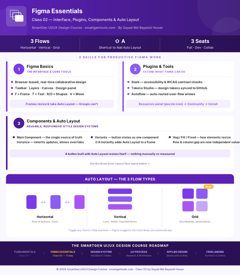
The infographic below maps Figma's core interface, the plugin categories worth installing first, and all three Auto Layout flow types side by side.
Where This Course Is Headed
| Module | Focus |
|---|---|
| 1 — Done | UI/UX Fundamentals: Color Theory, Color Psychology, Typography, Design Principles |
| 2 — Today | Figma Essentials: interface, plugins, components, and Auto Layout |
| 3 — Next | Design Systems: Variables, tokens, and building a reusable component library |
| 4 | The UX Process: user research, personas, empathy mapping, user flows, information architecture, wireframing |
| 5 | Applied Design: dashboards, landing pages, e-commerce and website design, prototyping |
| 6 | Portfolio, Case Studies & Freelancing |
Frequently Asked Questions
Do I need to pay for Figma to follow this course?
No. The free Starter plan includes a Full seat with everything covered in this class — the interface, plugins, components, and Auto Layout. Paid seats become relevant for teams needing full Dev Mode access or working at larger scale.
What's the difference between a plugin and a native Figma feature?
Plugins are built by the community or third parties and installed separately through the Resources panel. Native features — like Variables, Dev Mode, and AI tools — ship built into Figma itself. Several things that used to require plugins are now native, which is worth checking before installing something redundant.
Why should I use Auto Layout instead of just placing elements manually?
Manual placement is static — it breaks the moment content changes length, a screen gets translated into another language, or a teammate edits text. Auto Layout keeps spacing and sizing correct automatically, the same way a real coded interface would behave.
What is the new Grid option in Auto Layout, and when should I use it?
Grid is a two-dimensional layout mode, closer to CSS Grid than Flexbox, added as a mature feature after its Config 2025 introduction. Use it for anything Horizontal or Vertical alone can't cleanly express — dashboards, photo galleries, and bento-box style layouts where elements need to span multiple rows or columns.
What's the difference between detaching an instance and just editing it?
Editing text or swapping an icon inside an instance is a supported "override" — the instance stays linked to the main component for everything else. Detaching completely breaks that link, so the instance stops receiving any future updates from the main component. Only detach when you specifically need a permanent, one-off exception.
Is Dev Mode something I need to know as a designer, not just a developer?
It's worth understanding even if you're not the one using it daily. Dev Mode is how your designs get handed off — it shows exact spacing, color values, and code snippets. Knowing what a developer will see there helps you build files that hand off cleanly, without last-minute clarification threads.
How many plugins should I install as a beginner?
Start with one — Stark, for accessibility — and add others only when you hit a specific, recurring need. Installing dozens of plugins upfront usually just adds clutter to the Resources panel without changing your actual workflow.
What should I learn right after this class?
Class 03 covers Design Systems — Variables, design tokens, and how to turn the components and Auto Layout skills from today into a reusable library that scales across an entire product.
*This article is Class 02 of the free SmartGen UI/UX Design Course, written by
— Written by Sayad Md Bayezid Hosan for the SmartGen blog
 ✓
✓
Sayad Md Bayezid Hosan
Founder & Tech Entrepreneur | Full-Stack Developer
Full-stack Web Developer, Digital Marketing Strategist, and Tech Entrepreneur with 5+ years of experience delivering innovative digital solutions. Specializing in web development, AI integration, strategic digital marketing, and tech entrepreneurship. As a leading Tech Provider, I help audiences navigate digital platforms safely through permission-based technical solutions and digital business asset management.
Credentials & Expertise:
- Founder of CWB Agency & GenZFrontier
- Final-year English Student at Northern University Bangladesh
- Specialized in AI-powered web development & content strategy
- Published author on tech, digital marketing & entrepreneurship
Explore more free tools and guides at smartgentools.com.*