
August 14, 2026 • General • By Sayad Md Bayezid Hosan
UI/UX Design Course Class 01: Fundamentals
Researchers at Carleton University found that people form a lasting opinion about a website's visual appeal in about 50 milliseconds — roughly the time it takes to blink. Google later ran its own research and confirmed a similar window, with some judgments forming in as little as 17 milliseconds. That is the entire premise of UI/UX design in one number: before a single word gets read, color, layout, and type have already decided whether someone trusts what they're looking at.
This is Class 01 of the SmartGen UI/UX Design Course, and it covers the four building blocks everything else in this course rests on: what UI/UX design actually is, how color theory works, why color psychology matters (and where it gets oversold), the fundamentals of typography, and the core design principles that tie all of it together.
Welcome to Class 01 of the SmartGen UI/UX Design Course
This course is built to take you from zero design background to a working, practical understanding of UI/UX design — the kind you can actually apply, not just recognize on a slide. Later classes in this course move into Figma, the UX research process, applied app and web design projects, and eventually building a portfolio and finding freelance work. None of that holds up without the fundamentals in this class first. A beautifully laid-out Figma file built on poor color contrast and inconsistent type still fails the person using it.
So before touching any design software, this class stays entirely conceptual — and deliberately so. Every principle here transfers to every tool you'll ever use, while software interfaces change every few years.
1. What Is UI/UX Design?
UI (User Interface) is everything a person sees and directly interacts with: buttons, colors, icons, spacing, typography, the layout of a screen. UX (User Experience) is the entire journey a person has with a product — how easy it is to find what they need, how it makes them feel, whether it does what they expected, and whether they'd come back.
A useful way to separate the two: UI is what it looks like. UX is how it works.
Why the Two Can't Really Be Separated
Picture a checkout button that's perfectly styled — right color, right size, nice shadow, sits exactly where a designer intended. That's good UI. Now picture that same button buried three scrolls down a page, after a confusing form with no indication of what step you're on. The UI is excellent. The UX has failed completely, and the sale is lost anyway.
The reverse happens just as often. A product can have flawless information architecture and a genuinely intuitive flow, but if the interface uses low-contrast gray text on a white background, or uses five different fonts with no clear hierarchy, users will still struggle — not because the experience was designed badly, but because the interface is actively working against it.
Good products need both working in the same direction. That's the entire reason this class treats color, psychology, typography, and principles as one connected topic instead of four separate ones.
Related Roles You'll Hear Mentioned
As you go further into design work — especially once freelancing comes up later in this course — you'll see these titles used somewhat interchangeably, though they lean toward different parts of the process:
- UI Designer — focuses primarily on visual design: color, typography, layout, component design.
- UX Designer — focuses primarily on research, flows, information architecture, and usability testing.
- UX Researcher — focuses specifically on understanding user behavior through interviews, testing, and data.
- Product Designer — a broader title that typically covers both UI and UX, often with more involvement in business and product strategy.
At smaller companies and in most freelance work, one person often wears all four hats — which is exactly why this course builds the fundamentals for all of them before specializing.
2. Color Theory: The Designer's Foundation
Color is the first thing anyone perceives about a design, often before they've consciously registered layout or text. Color theory is simply the structured, learnable system behind what makes color combinations feel balanced instead of accidental.
The Color Wheel
The traditional color wheel organizes color into three tiers:
- Primary colors — red, yellow, and blue. These can't be created by mixing other colors.
- Secondary colors — orange, green, and purple. Each is made by mixing two primary colors.
- Tertiary colors — colors like red-orange or blue-green, made by mixing a primary with a neighboring secondary.
Digital designers rarely mix paint, but the wheel still matters because it's the map every color harmony below is built from.
Building Color Harmonies
A "harmony" is simply a formula for picking colors that work together, based on their position on the wheel.
| Harmony Type | How It Works | Best Used For |
|---|---|---|
| Complementary | Two colors directly opposite each other (blue & orange) | High-contrast call-to-action buttons, energetic brands |
| Analogous | Three colors sitting next to each other (blue, teal, green) | Calm, cohesive interfaces — wellness and finance apps |
| Triadic | Three colors evenly spaced around the wheel | Playful, vibrant products — kids' apps, entertainment |
| Split-Complementary | A base color plus the two colors beside its complement | Bold contrast with slightly more balance than pure complementary |
| Monochromatic | Different tints and shades of a single hue | Minimal, elegant dashboards and corporate tools |
None of these is objectively "better" — the right harmony depends entirely on what the product needs to communicate. A meditation app reaching for a triadic red-yellow-blue scheme would fight against its own purpose.
Warm vs. Cool Colors
Reds, oranges, and yellows are warm — they tend to feel energetic, urgent, or inviting, and they visually advance toward the viewer. Blues, greens, and purples are cool — they tend to feel calm, trustworthy, or professional, and they visually recede. Most real interfaces mix both: a cool, neutral base (blues and grays) with one warm accent color reserved specifically for the action you most want someone to take.
How Designers Actually Work With Color on Screens
Print design uses CMYK. Screens don't. As a UI/UX designer, you'll work almost exclusively in three formats:
- HEX — a six-character code like
#3B82F6, the most common format in design tools and CSS. - RGB — Red, Green, Blue values from 0–255 each, e.g.
rgb(59, 130, 246). - HSL — Hue, Saturation, Lightness, e.g.
hsl(217, 91%, 60%). This format is often the easiest to reason about, since adjusting lightness alone gives you an instant tint or shade of the same color without guessing new HEX values.
If you want to pull a color palette directly from a photo or a piece of inspiration you've found, the SmartGen Color Palette Extractor does this instantly — upload an image and it returns the dominant HEX codes so you can build a coherent palette from something you're already drawn to, rather than guessing.
The 60-30-10 Rule
This is the single most practical color rule in UI design: 60% of your interface should use a dominant, usually neutral color (backgrounds, large surfaces), 30% a secondary color (supporting elements, secondary buttons, headers), and 10% an accent color reserved almost exclusively for the action you want users to notice — usually your primary call-to-action button. Interfaces that ignore this ratio tend to either feel visually flat (too much of one neutral color) or overwhelming (too many competing colors fighting for attention at once).
If you want to test how a full color scheme feels together before committing, the SmartGen Color Schemes tool and HTML Color Picker are both useful for previewing combinations against the 60-30-10 split described above.
Where Color Meets Accessibility
Color choice isn't purely aesthetic — it has a hard technical floor. The Web Content Accessibility Guidelines (WCAG) require a minimum contrast ratio of 4.5:1 between text and its background for normal-sized text, and 3:1 for large text and interactive UI components, to meet Level AA compliance — the baseline most legal and industry standards are built around. This isn't a minor detail: research from WebAIM's ongoing accessibility audits has found that contrast failures appear in over 80% of websites tested, making it the single most common accessibility violation on the web. We'll come back to exactly why this matters in Section 5.
3. Color Psychology: Why Colors Make Us Feel Things
Color psychology is the study of how color influences perception and emotion. It's genuinely useful — and also one of the most oversimplified topics in design content online, so it's worth covering carefully rather than handing you a chart and calling it science.
Common Color Associations in Western Design
The table below reflects patterns that show up consistently across Western commercial design — not universal laws of human perception.
| Color | Common Association | Frequently Seen In |
|---|---|---|
| Red | Urgency, passion, appetite, danger | Sale banners, error states, food delivery apps |
| Blue | Trust, calm, stability, professionalism | Banking apps, social platforms, healthcare |
| Green | Growth, health, "go" / success | Financial gains, eco-friendly brands, confirmations |
| Yellow | Optimism, energy, caution | Warning states, youthful or playful brands |
| Purple | Creativity, luxury, imagination | Beauty brands, creative tools, premium tiers |
| Black | Sophistication, authority, premium | Luxury goods, high-end technology |
| White | Simplicity, cleanliness, openness | Minimalist apps, healthcare, Apple-style interfaces |
The Important Caveat: Context and Culture Change Everything
This is the part most beginner design content skips. Color meaning is not fixed or universal — it shifts by culture, industry, and individual experience. White reads as purity and simplicity in most Western design, but represents mourning in several East Asian cultures. Red signals danger and "stop" across most of the West, but represents luck and celebration throughout much of Chinese culture. Even within one culture, context overrides convention constantly — red means "error" in a form field, but the exact same red means "sale, buy now" on an e-commerce banner two inches away.
The honest takeaway: treat color psychology as a reasonable starting hypothesis, not a settled rule. Test real color choices against your actual audience whenever the stakes are high enough to justify it, rather than assuming a chart from a blog post applies universally.
Designing for Colorblind Users
This is where color psychology and accessibility intersect directly. Color vision deficiency affects roughly 8% of men and 0.5% of women worldwide — around 300 million people globally — with red-green color blindness accounting for about 99% of cases. That means in any reasonably sized user base, a meaningful slice of your audience physically cannot distinguish the "urgent red" from the "confirmed green" your color psychology chart promised would communicate two opposite things.
The practical rule that follows: never use color as the only signal for meaning. An error state should pair red with an icon and text, not red alone. A "success" state needs a checkmark, not just a green background. This single habit prevents an entire category of accessibility failures before they happen.
4. Typography: Giving Your Interface a Voice
If color sets the mood, typography carries the actual content — and it does more of the communicative work than most beginners initially assume.
Font Categories
- Serif — fonts with small decorative strokes at the ends of letters (like Georgia or Times New Roman). They tend to read as traditional, editorial, or trustworthy.
- Sans-serif — fonts without those strokes (like Inter, Helvetica, or Roboto). They read as clean, modern, and are the dominant choice for digital interfaces because they render clearly at small sizes on screens.
- Monospace — every character occupies equal width (like Fira Code or Courier). Used almost exclusively for code, technical data, or anything that needs to align in columns.
- Display / Decorative — expressive, stylized fonts meant for large headlines only. They break down and become unreadable at body-text sizes.
Building a Type Hierarchy
Typography creates order through deliberate contrast in size, weight, and spacing — not through arbitrary variation. A typical hierarchy moves from a large, bold headline (H1) down through progressively smaller subheadings (H2, H3) to a comfortably sized, lighter-weight body text, with captions or metadata smaller still. This hierarchy is what lets someone scan a screen in two seconds and immediately know what matters most, without reading every word — the same principle behind why this article uses headings the way it does.
Readability Rules That Actually Matter
- Line length: aim for roughly 50–75 characters per line. Shorter lines force the eye to jump too often; longer lines make it easy to lose your place returning to the start of the next line.
- Line height (leading): set line height around 1.4–1.6× the font size. Text set too tight feels cramped and fatiguing to read; too loose and lines feel disconnected from each other.
- Minimum size: body text on the web should generally sit at 16px or larger. Smaller sizes push accessibility problems onto users with any degree of visual impairment — which, combined with age-related vision changes, is a substantial share of any general audience.
Pairing Fonts Without Making a Mess
The safest, most reliable rule for beginners: limit any single interface to two or three fonts total — often just one, used at different weights and sizes. When pairing two, choose fonts with clear contrast in personality (a distinctive display font for headlines, paired with a neutral, highly readable sans-serif for body text) rather than two fonts that are almost — but not quite — the same, which reads as a mistake rather than a choice.
Typography Meets Accessibility
Beyond size, avoid setting long passages of body text in all caps — it removes the natural shape cues (ascenders and descenders) that make words fast to recognize, slowing reading speed measurably. And exactly like color, typography needs sufficient contrast against its background — a beautifully chosen font in light gray on white fails the same 4.5:1 contrast requirement covered in the next section, regardless of how good the font choice itself is.
5. Core UI/UX Design Principles
This section is where color, psychology, and typography stop being separate topics and become one connected design practice. These principles apply regardless of what you're designing — a mobile app, a dashboard, or a landing page you'll build in later classes.
Visual Hierarchy
Visual hierarchy is the deliberate use of size, color, contrast, and position to guide the eye to what matters most, first. Every screen should have one clear focal point — usually the primary action you want a user to take — with everything else supporting, not competing with, that focal point.
Consistency
The same element should look and behave the same way everywhere it appears. If a "Save" button is blue and rounded on one screen, it shouldn't become green and square on the next. Consistency is what lets users build a mental model of how a product works, so they stop having to relearn it on every screen.
Contrast & Accessibility
This is where Section 2's WCAG numbers become an active design principle, not just a technical footnote. Every meaningful text-to-background pairing needs to hit 4.5:1 for normal text and 3:1 for large text and UI components (like button borders and icons) to meet WCAG 2.1/2.2 Level AA — the standard most accessibility audits and legal requirements are measured against today. WCAG 3.0 is still a working draft as of 2026, expected to eventually introduce a more nuanced contrast algorithm — but 2.1/2.2 AA remains the practical bar to design against right now.
Feedback & Affordance
Affordance means an element visually suggests how it should be used — a button should look pressable, a toggle should look toggleable. Feedback means the interface responds every time a user takes an action — a button changes state when clicked, a form shows a clear success or error message, a loading state appears while something processes. Interfaces that go silent after an action leave users unsure whether anything happened at all, which is one of the fastest ways to erode trust in a product.
Simplicity and Cognitive Load
Hick's Law — a well-established finding in human-computer interaction — states that the time it takes someone to make a decision increases with the number and complexity of choices available. In practice: every unnecessary button, option, or piece of text on a screen adds a small tax to how quickly someone can act. Good design constantly asks what can be removed, not just what can be added.
White Space
Empty space isn't wasted space — it's what makes everything else on a screen legible and calm rather than cramped and chaotic. Generous spacing around text and elements consistently reads as more premium, more trustworthy, and easier to scan, even though nothing about the actual content has changed.
Grounded in a Real Framework: Nielsen's 10 Usability Heuristics
These six principles aren't invented for this course — they align closely with Jakob Nielsen's 10 Usability Heuristics, first published in 1994 through the Nielsen Norman Group and still the most widely cited usability framework in the industry today.
| # | Heuristic | What It Means in Practice |
|---|---|---|
| 1 | Visibility of system status | Always show users what's happening — loaders, progress, confirmations |
| 2 | Match between system and the real world | Use familiar language and concepts, not internal jargon |
| 3 | User control and freedom | Always provide an obvious way to undo or go back |
| 4 | Consistency and standards | The same element should behave the same way everywhere |
| 5 | Error prevention | Design so mistakes are hard to make in the first place |
| 6 | Recognition rather than recall | Show options; don't make users remember them |
| 7 | Flexibility and efficiency of use | Support shortcuts for experienced users without cluttering things for beginners |
| 8 | Aesthetic and minimalist design | Remove anything that doesn't serve the content or the task |
| 9 | Help users recognize, diagnose, and recover from errors | Plain-language error messages that suggest a fix |
| 10 | Help and documentation | Make help easy to find, searchable, and task-focused |
You don't need to memorize this list today — but recognizing it will make every later class in this course, and every design critique you ever receive, make a lot more sense.
Common Mistakes Beginners Make
- Picking colors because they look nice, without testing contrast. A palette can be visually appealing and still fail WCAG AA — always check, don't assume.
- Using more than two or three fonts in one design. Almost always reads as inconsistent rather than expressive.
- Relying on color alone to communicate status. Pair every red/green/yellow state with an icon or text label too.
- Ignoring line length and line height. Beautiful typography set too tight or too wide still fails to be readable.
- Copying a color psychology chart literally. Treat it as a hypothesis to test against your actual audience, not a guarantee.
- Designing with no white space. Cramming more in rarely communicates more — it usually communicates less, more slowly.
- Only checking designs at desktop size. A font size or contrast ratio that works on a large monitor can fail completely on a small phone screen in daylight.
Practice: Your First Design Audit
You don't need any design software to start applying this class — just three apps or websites you already use regularly. For each one, spend five minutes answering:
- Colors: What's the dominant color (60%)? The secondary color (30%)? What single accent color (10%) is used for the main action button? (The SmartGen HTML Color Picker can help you pull exact HEX values if you're inspecting screenshots.)
- Typography: How many distinct fonts can you spot? Is there a clear size/weight hierarchy between headings and body text?
- Hierarchy: What's the very first thing your eye lands on on the main screen? Is that the same thing the product most wants you to do?
- Accessibility: Can you find any text that feels hard to read against its background? Would it likely pass a 4.5:1 contrast check?
This exercise trains the single most valuable habit in design: noticing deliberate choices in products you already trust, instead of only critiquing your own work in isolation.
Knowledge Check
1. What's the core difference between UI and UX?
UI is what a product looks like and the elements a user directly interacts with. UX is the entire experience of using the product — how easy, intuitive, and satisfying that journey feels.
2. Name three of the five color harmony types covered in this class.
Any three of: complementary, analogous, triadic, split-complementary, monochromatic.
3. What WCAG AA contrast ratio is required for normal body text?
4.5:1 (with 3:1 for large text and UI components).
4. True or false: color psychology means the same color triggers the same emotion in every culture.
False. Color associations shift significantly by culture, industry, and context — they're a starting hypothesis, not a universal rule.
5. Why does limiting a design to two or three fonts usually produce a better result?
More than that tends to read as inconsistent or accidental rather than intentional, and it works against the hierarchy that helps users scan a screen quickly.
Visual Summary
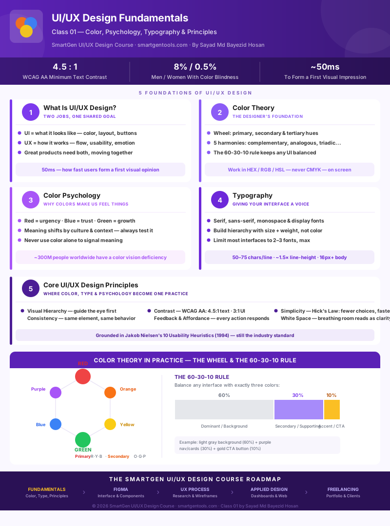
The infographic below maps all five fundamentals covered in this class — including a working color wheel and the 60-30-10 color distribution rule — as a single visual reference.
Where This Course Is Headed
This class is the foundation. Here's the shape of what's ahead:
| Module | Focus |
|---|---|
| 1 — Today | UI/UX Fundamentals: Color Theory, Color Psychology, Typography, Design Principles |
| 2 | Figma: interface, plugins, components, auto layout, and building a design system |
| 3 | The UX Process: user research, personas, empathy mapping, user flows, information architecture, wireframing |
| 4 | Applied Design: dashboards, landing pages, e-commerce and website design, prototyping |
| 5 | Portfolio, Case Studies & Freelancing: presenting your work, freelance marketplaces, and getting paid |
If you want a head start on visual asset skills before Module 2, our Basic Image and Video Editing guide (Filmora & Canva) covers tools many designers use for quick mockups and moodboards before ever opening Figma.
Frequently Asked Questions
What's the difference between UI design and UX design?
UI (User Interface) design covers the visual and interactive elements a person sees and touches — buttons, color, typography, layout. UX (User Experience) design covers the entire journey someone has with a product, including usability, flow, and how it makes them feel. Most real design work involves both together.
Do I need to know how to code to learn UI/UX design?
No. UI/UX design and front-end development are related but separate skills. Understanding basic HTML/CSS concepts (like how HEX colors work, covered in this class) helps you communicate with developers, but it isn't a requirement to design well.
What's the best color scheme for a beginner to start with?
Start with a monochromatic or analogous scheme using the 60-30-10 rule from Section 2 — it's the hardest combination to get visually wrong, and it teaches restraint before you move on to bolder complementary or triadic palettes.
Is color psychology backed by real science?
Partially, and with real limits. There's genuine research behind broad tendencies (warm colors reading as more urgent, for example), but color psychology is far more context- and culture-dependent than most infographics suggest. Treat it as a starting point to test, not a rule to follow blindly.
How many fonts should I use in one design?
Two to three at most, and often just one font used at different weights and sizes is enough. More than that usually reads as inconsistent rather than intentional.
What is WCAG and why does it matter for designers, not just developers?
WCAG (Web Content Accessibility Guidelines) is the standard framework for making digital content usable by people with disabilities, including visual impairments and color blindness. Contrast ratio — a direct design decision, not a coding one — is one of its most common failure points, which is why it belongs in a design fundamentals class, not just a developer's checklist.
Do I need Figma to follow this course?
Not for this class. Class 01 is entirely conceptual by design, so the principles transfer to any tool. Figma setup begins in Module 2.
What's the difference between UI/UX design and graphic design?
Graphic design is typically static and one-directional — posters, logos, print materials. UI/UX design is interactive and system-based — it has to account for different screen sizes, user states (loading, error, success), and how a person actually behaves when using it, not just how it looks in a single frame.
How long does it take to learn UI/UX design fundamentals?
The concepts in this class can be understood in a single sitting, but recognizing them consistently in real products — the goal of the practice exercise above — is a habit that builds over weeks, not hours. Give yourself time to notice these patterns in apps you already use before moving to Module 2.
What should I learn after color, typography, and design principles?
Module 2 of this course moves into Figma — the industry-standard design tool — starting with its interface, then components, auto layout, and building your first design system, which is where these fundamentals get applied directly.
*This article is Class 01 of the free SmartGen UI/UX Design Course, written by
— Written by Sayad Md Bayezid Hosan for the SmartGen blog
 ✓
✓
Sayad Md Bayezid Hosan
Founder & Tech Entrepreneur | Full-Stack Developer
Full-stack Web Developer, Digital Marketing Strategist, and Tech Entrepreneur with 5+ years of experience delivering innovative digital solutions. Specializing in web development, AI integration, strategic digital marketing, and tech entrepreneurship. As a leading Tech Provider, I help audiences navigate digital platforms safely through permission-based technical solutions and digital business asset management.
Credentials & Expertise:
- Founder of CWB Agency & GenZFrontier
- Final-year English Student at Northern University Bangladesh
- Specialized in AI-powered web development & content strategy
- Published author on tech, digital marketing & entrepreneurship
Explore more free tools and guides at smartgentools.com/blog/.*